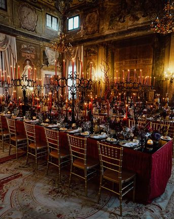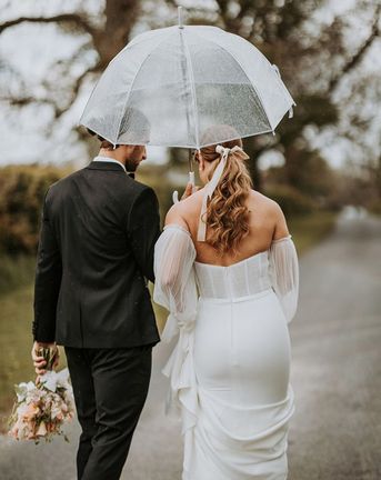
£25k - £30k
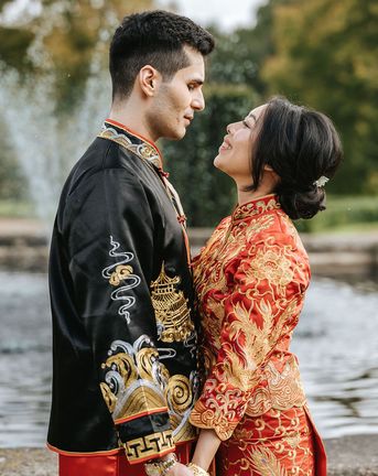
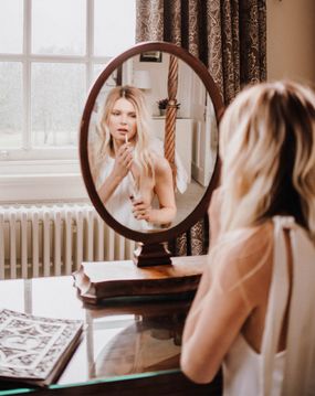
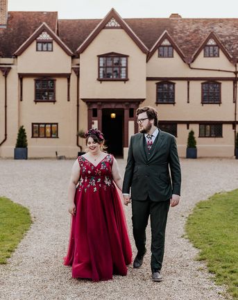
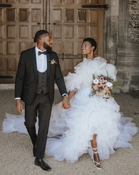
Red Wedding Dress For Ufton Court Wedding
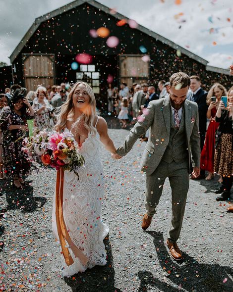
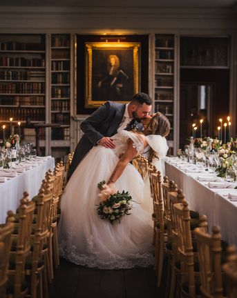
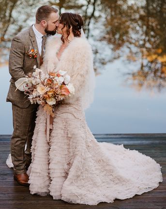
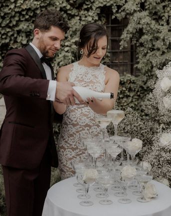
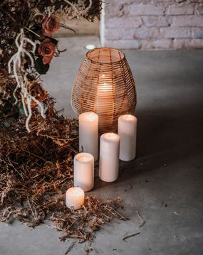
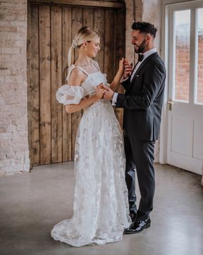
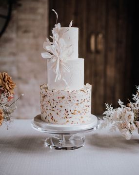
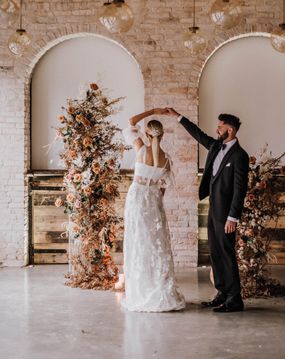
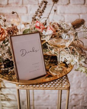
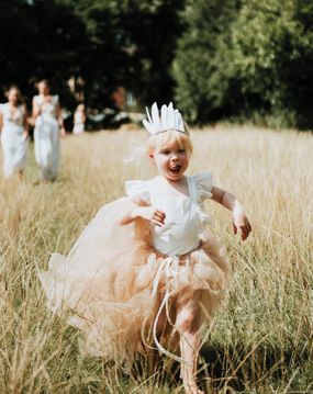
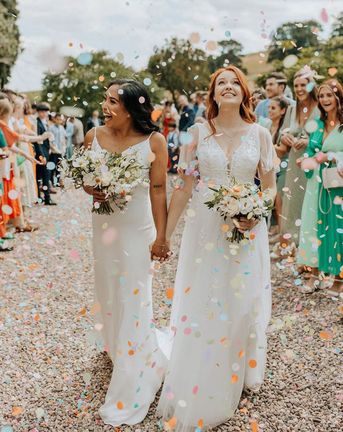
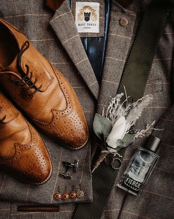
Wedding planning is really exciting but can be a little challenging. On Rock My Wedding, you’ll find stylish, unique, inspirational weddings and words of wisdom from real planning couples. Plus, you can use our curated list of Recommended Suppliers. From talented florists and beautiful venues to innovative catering and engaging entertainers, theres a supplier for everyone on our recommended list.