Real Wedding
Intimate Wedding Dinner Party At Italian Villa
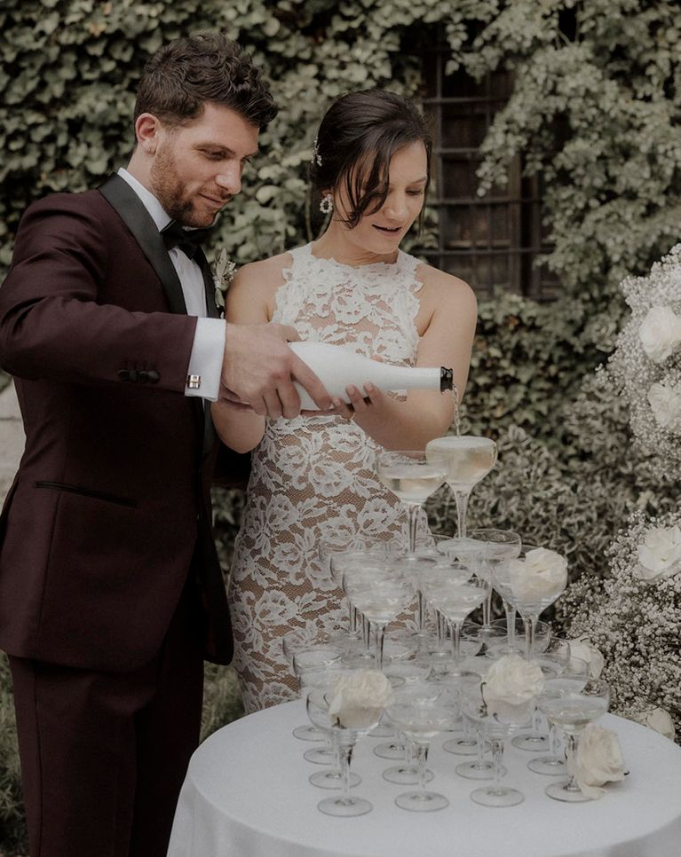
For weddings with under 100 guests, we have often seen couples opt for an intimate wedding dinner party. This involves inviting your nearest and dearest abroad for a once-in-a-lifetime dinner party that showcases local cuisine and culture whilst also celebrating L-O-V-E! This is exactly what Natalie & Marco did at the stunning Badia di San Vittore in Italy with an all-white theme that complements the minimal and rustic vibe of their venue, this wedding is timeless and elegant.